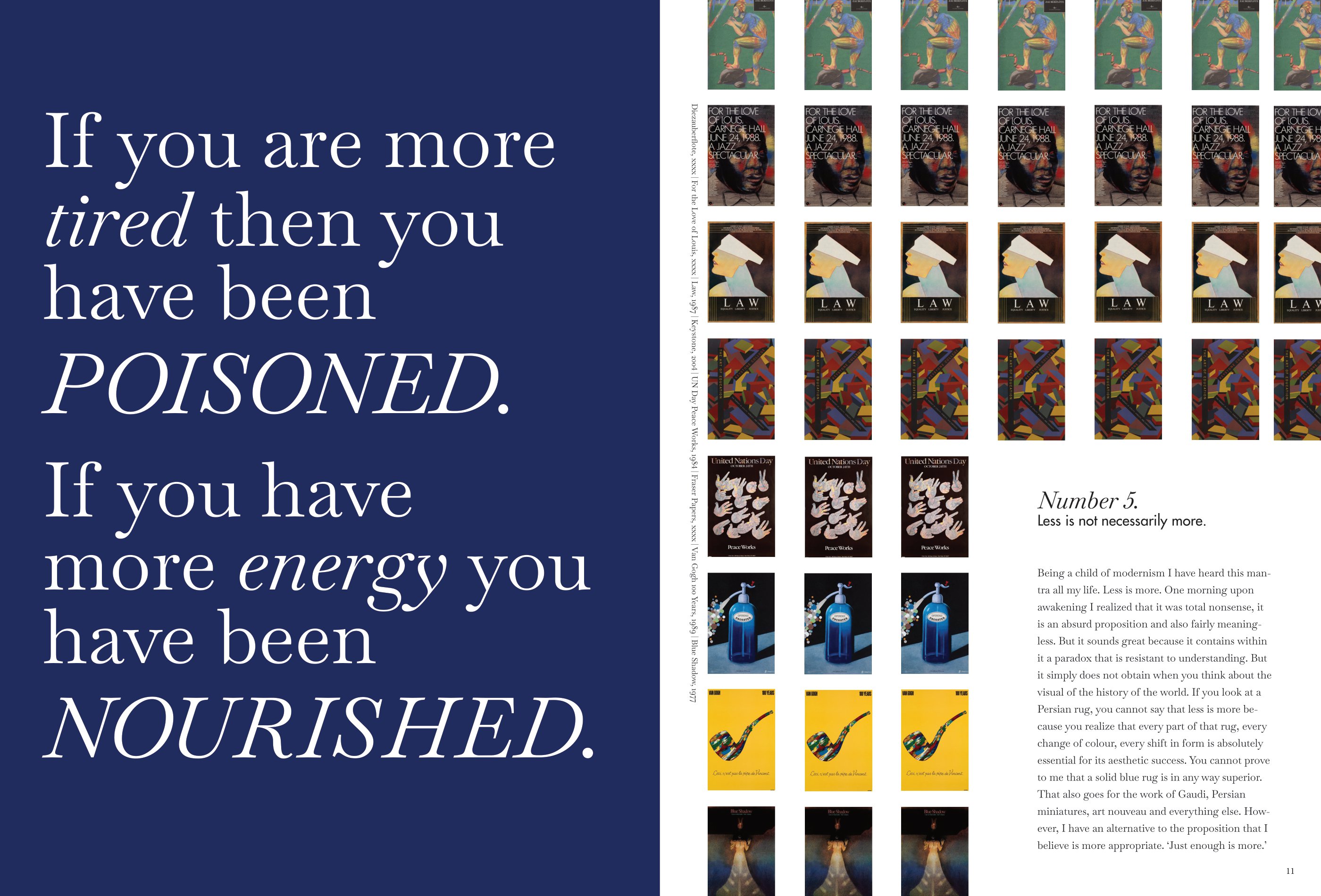
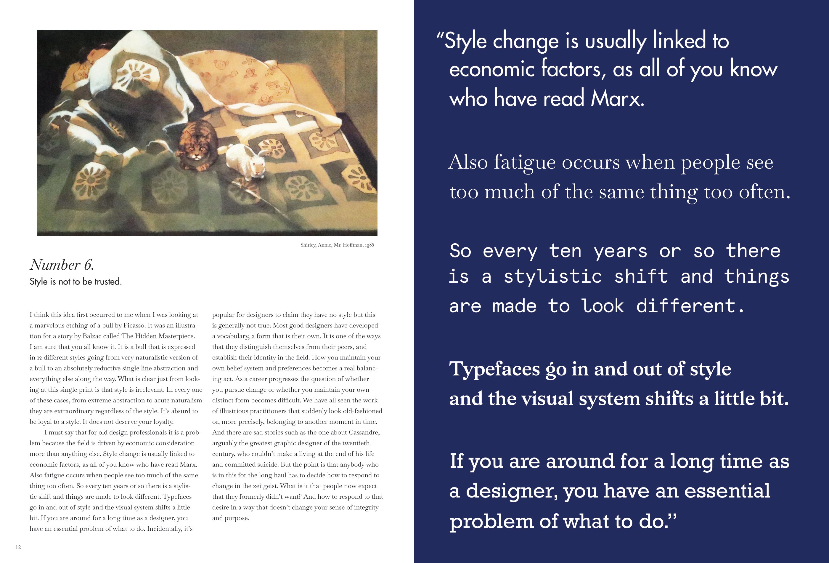
THIS IS WHAT I HAVE LEARNED
is a magazine layout using an excerpt from an interview with Milton Glaser.
7” x 9.5”.
is a magazine layout using an excerpt from an interview with Milton Glaser.
7” x 9.5”.


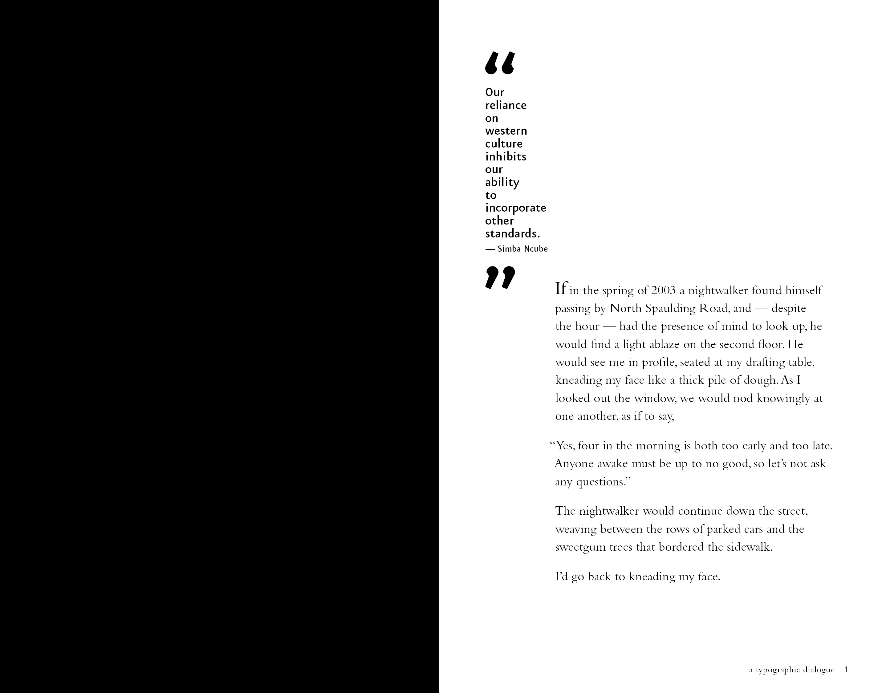
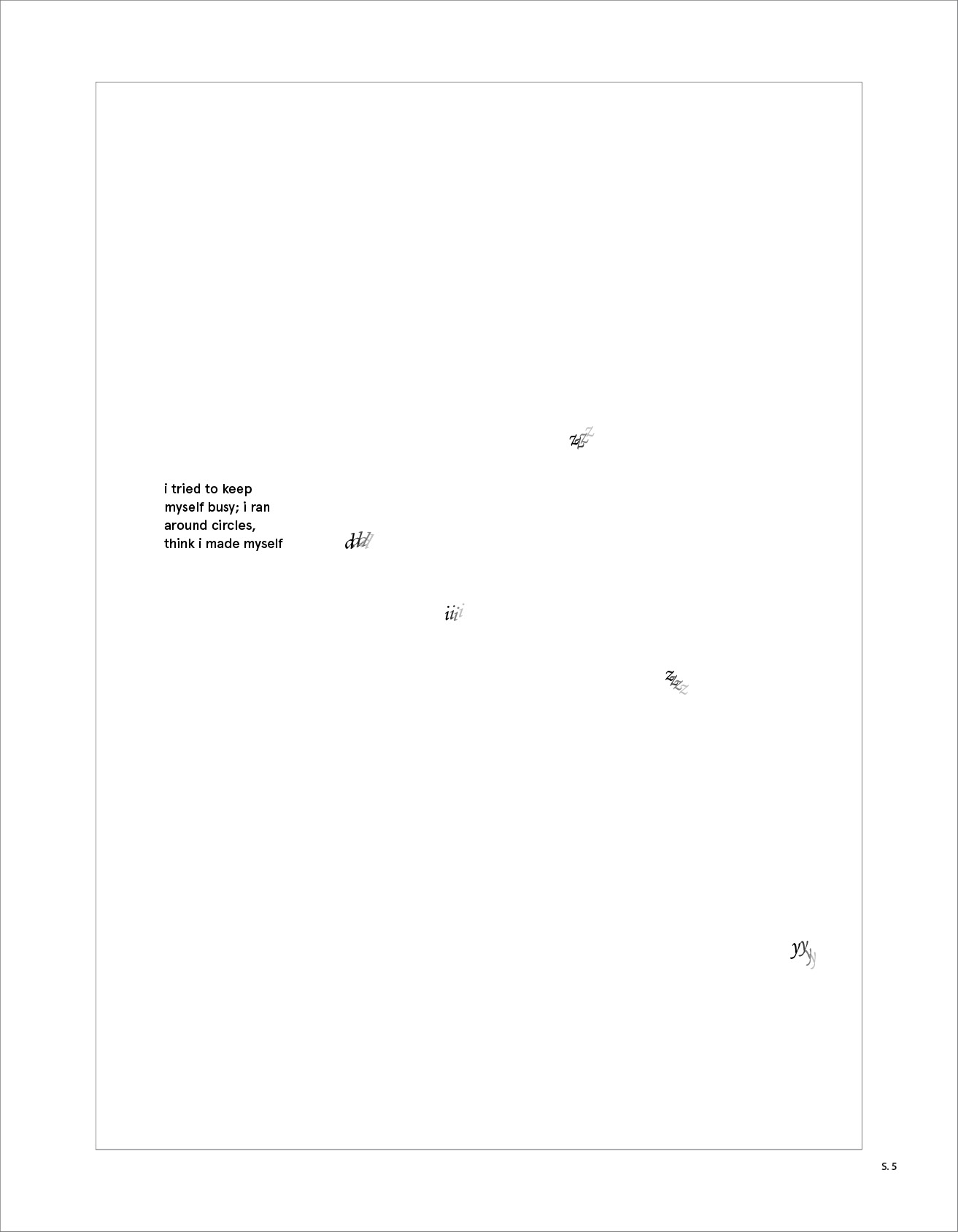
ONE BOOK, TWO VOICES
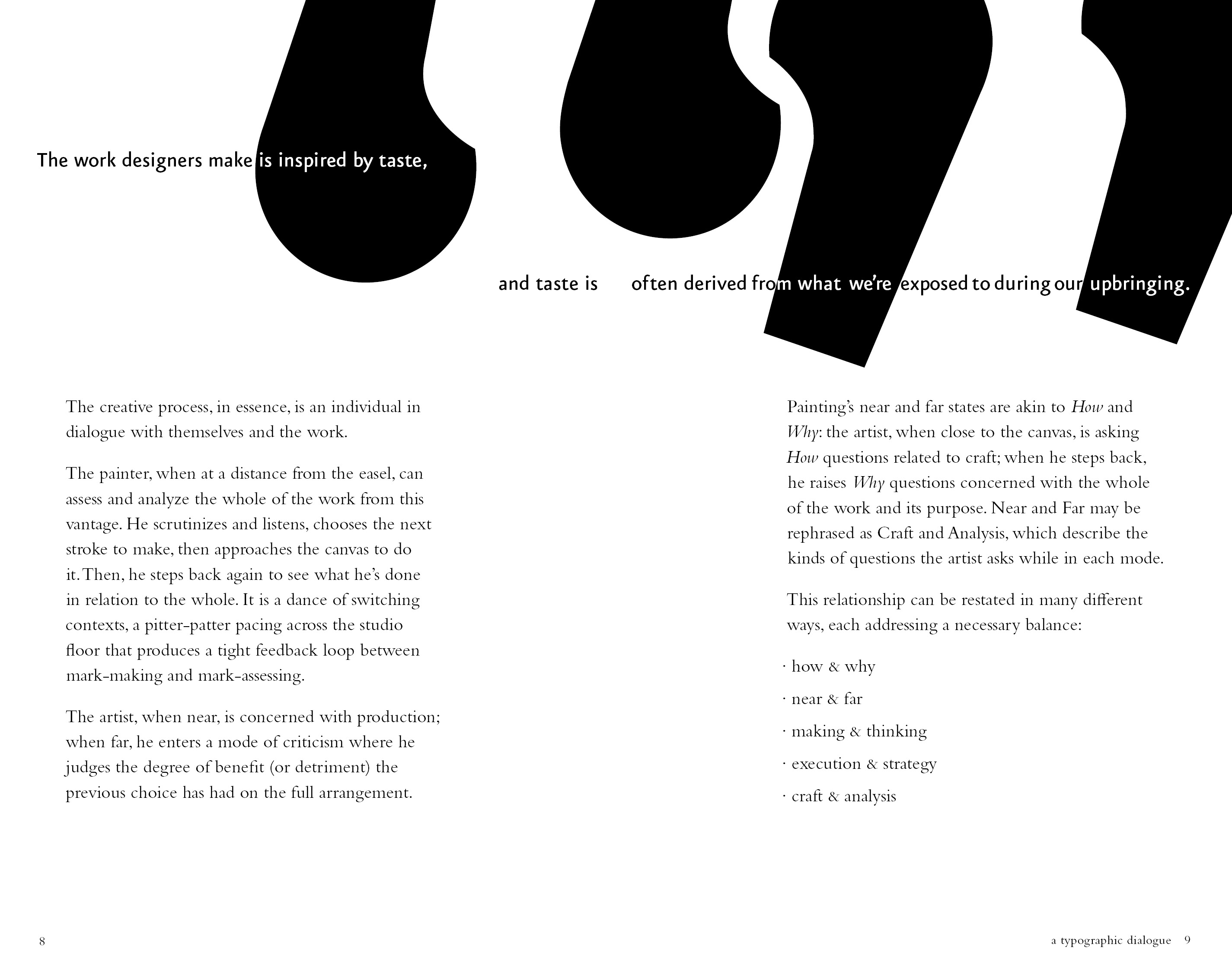
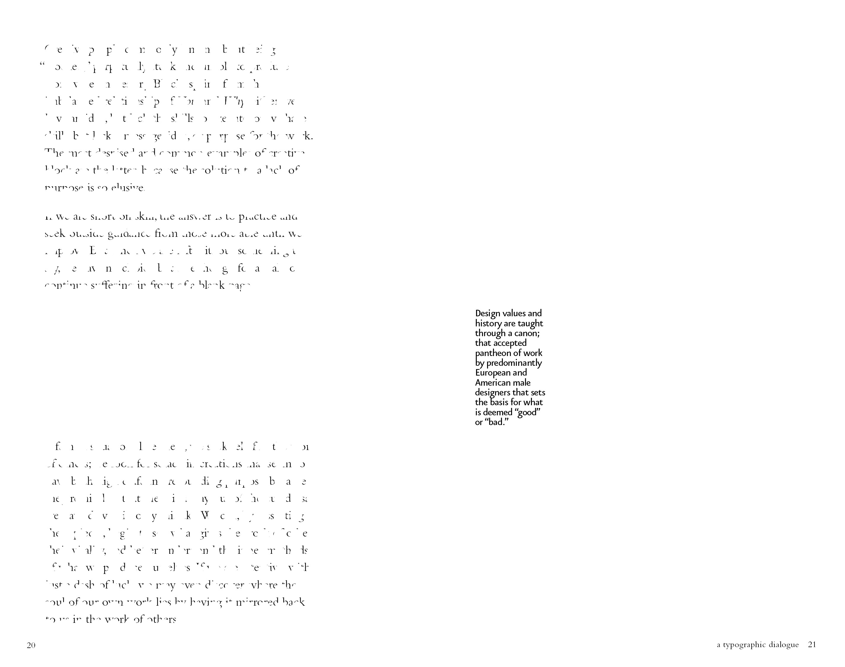
combines two texts. the primary text is Frank Chimero’s “How and Why”, and the expressive text is Anoushka Khandwala’s article "What Does it Mean to Decolonize Design?". I found her writing refreshing and filled in some of the gaps of Chimero’s writing. This design aims to put more focus on her words, sometimes overpowering Chimero’s. It aims to center the voice of a woman of color in design.
8.5”x 5.5”.
8.5”x 5.5”.


FOR US BY US
is a typgraphic poster promoting a fictional social justice event. the parameters for the poster were to have three levels of interest (far, mid, and up close). the main focus of this project was to create a well designed hierarchy within the poster that features the title, tagline, artist/speakers, tour dates, ticket purchase, and sponsors.
18”x 24”.
18”x 24”.

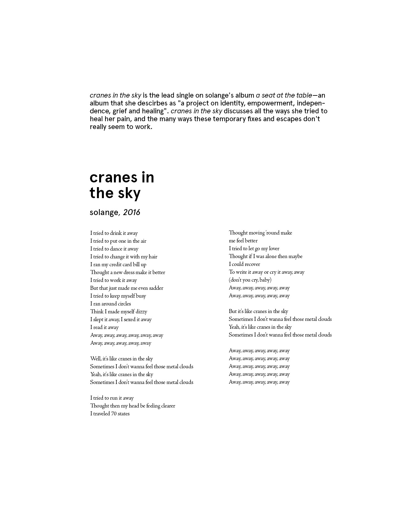
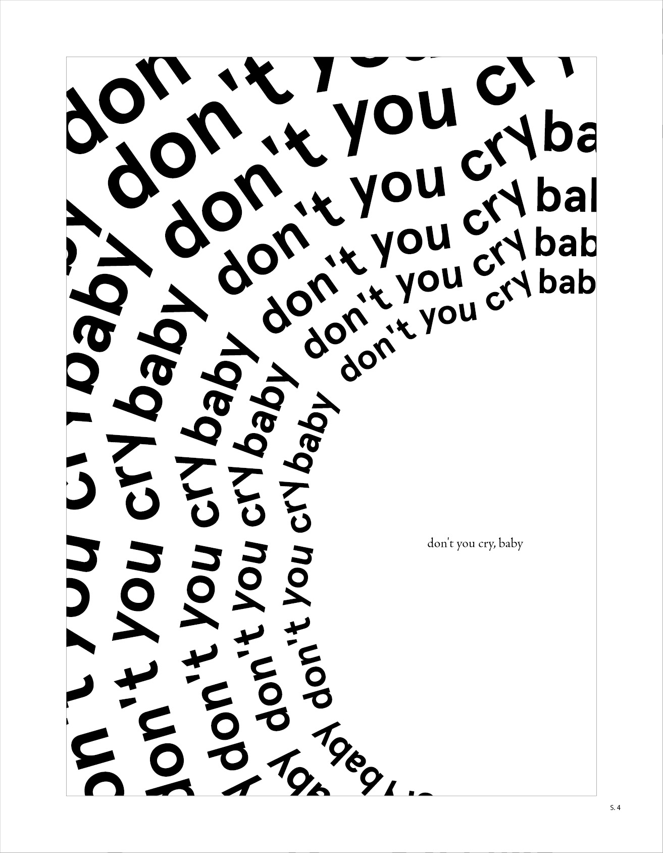
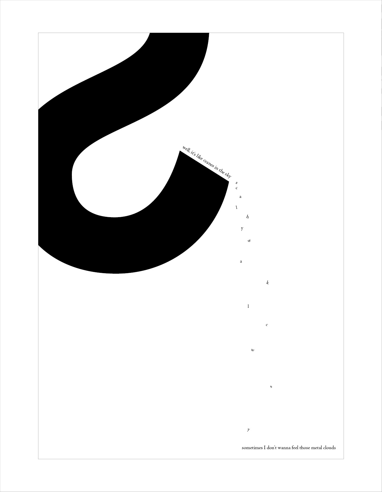
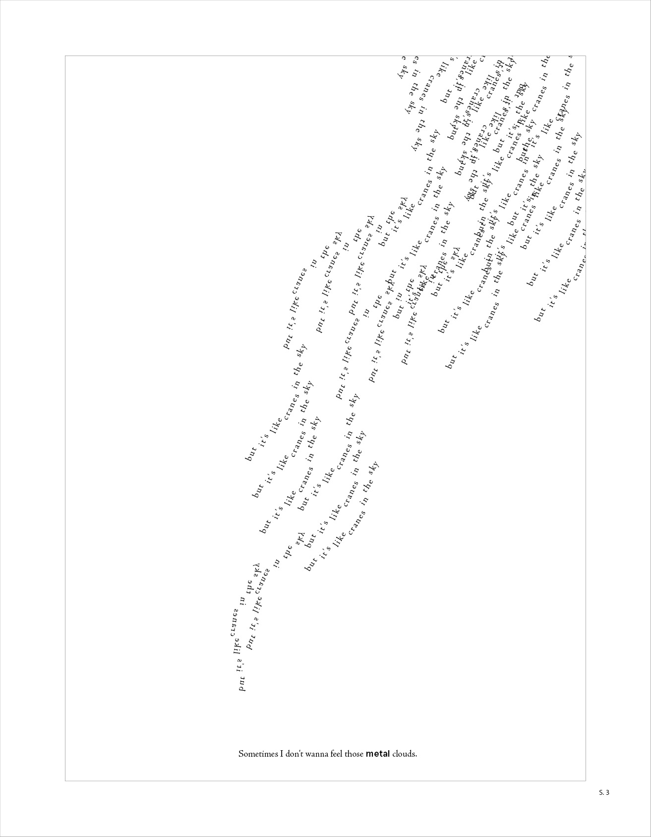
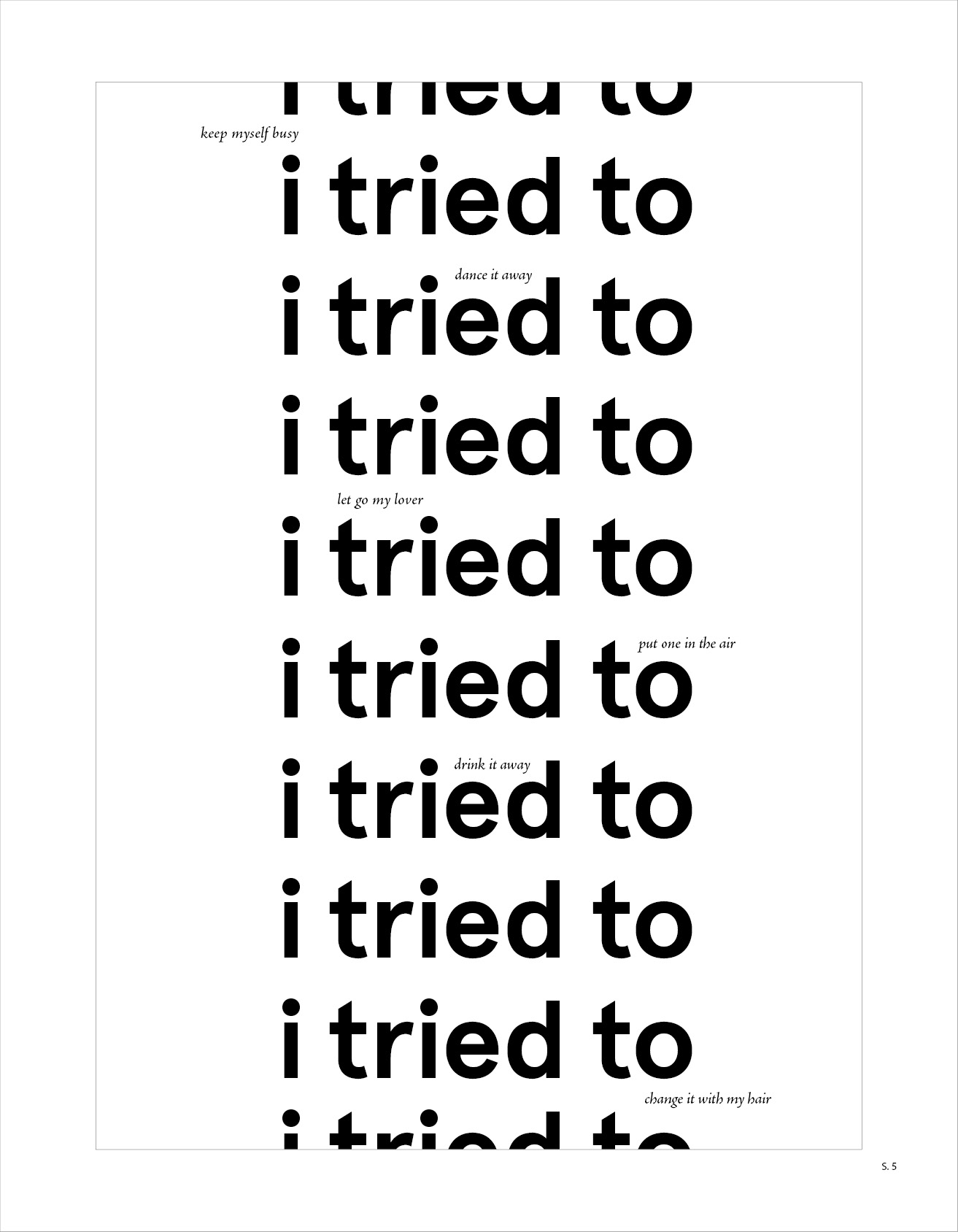
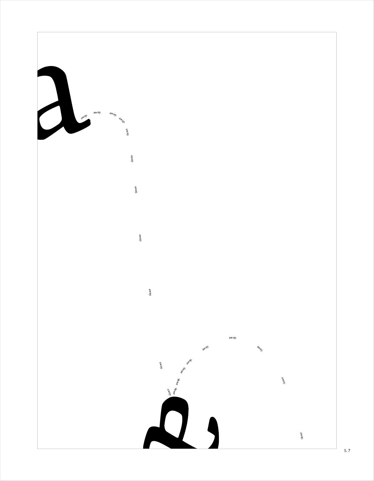
CRANES IN THE SKY
is an exploration of expressive typography using the lyrics from one song.
depicted are solange’s lyrics from cranes in the sky and the typfaces used are jenson and apercu.
8.5” x 11”
depicted are solange’s lyrics from cranes in the sky and the typfaces used are jenson and apercu.
8.5” x 11”


AQUAFARM
is an exploration of hierarchy and designing for multiple formats: phone, booklet, poster all while keeping branding consistent.
18” x 24”
to view the phone play through click here.
is an exploration of hierarchy and designing for multiple formats: phone, booklet, poster all while keeping branding consistent.
18” x 24”
to view the phone play through click here.
poster
![]()

REVEAL/OBSCURE
is an exploration of type in expressive and informational forms. orginally a 40 page slide deck. displayed are only a select few variations.
18” x 27”
is an exploration of type in expressive and informational forms. orginally a 40 page slide deck. displayed are only a select few variations.
18” x 27”